Al Waseelah Tour Website
A fast, mobile-first travel website for Al Waseelah — browse packages, compare hotels, and book with clarity and confidence.
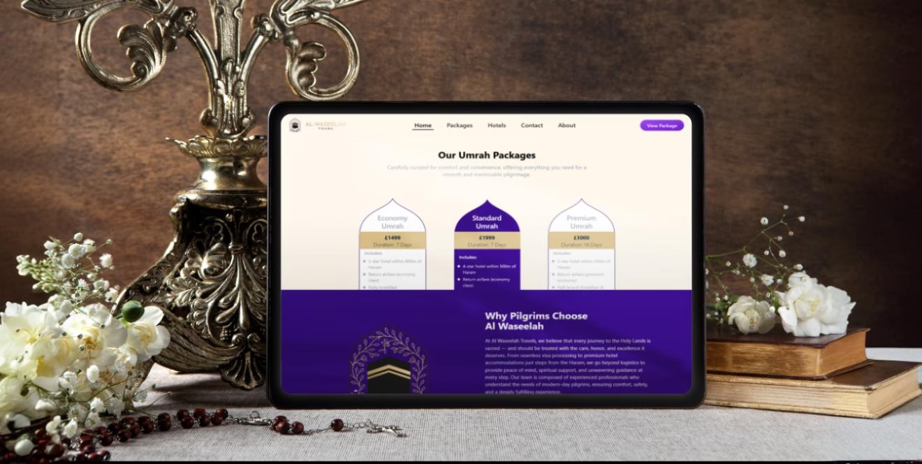
About the Project
Al Waseelah needed a lightweight, conversion-focused travel site that helps visitors quickly explore packages, compare hotels, and reach out with confidence. We designed a mobile-first experience with a clear hero and primary CTAs, an organized Packages flow, and hotel details that surface the essentials—pricing, amenities, and availability cues. Contact paths are streamlined (call, WhatsApp, and form), while trust signals like agency credibility and service scope are presented up front. The result moves users from discovery to inquiry in a few taps and keeps the interface fast, clear, and reliable for travelers on the go.
Problems
Before the revamp, the experience suffered from scattered navigation between Packages, Hotels, and Contact; inconsistent package info that made comparisons hard; limited mobile optimization; and unclear inquiry flows (users weren’t sure whether to call, message, or submit a form). Trust signals were not prominent, and there was no simple way to track which touchpoints (phone, WhatsApp, form) converted best. These issues increased drop-offs and made performance tracking and optimization difficult.
Our Solutions
- Implemented a focused hero with primary CTAs to explore Packages and Hotels, plus quick contact actions.
- Structured a consistent package card pattern (price cues, highlights, inclusions/exclusions) to enable quick comparisons.
- Built a hotel listing flow with crisp essentials (amenities, location hints, rate visibility) and a direct path to inquire.
- Optimized for mobile with performant images, reduced layout shift, and smooth, accessible navigation.
- Added clear inquiry routes (call, WhatsApp, and form) and confirmation UX to reduce friction and missed leads.
- Integrated analytics for click-to-call, WhatsApp taps, and form submissions to track funnels and improve campaigns.
Animations
Animations focused on reinforcing freshness and quality: hero ingredients used gentle floating motions with subtle scale transforms, meal cards revealed through staggered fade-up transitions, the delivery zone checker featured smooth progress indicators, nutritional badges appeared with spring-loaded scaling, and the subscription flow used guided transition animations. All animations maintained 60fps performance on mobile devices and included reduced-motion alternatives for accessibility compliance, keeping durations between 300-500ms for optimal user experience.
Tech Stack
Frontend
React JS, TailwindCSS, Framer Motion, React Query
Backend
Payments
Stripe (cards, wallets); manual invoice for wholesale
Infra
Firebase
Observability